Image

This guide is intended to help content managers understand their users’ accessibility needs as described by the Web Content Accessibility Guidelines (WCAG) particular to content creation, and how best to attend to them.
Provide text alternatives for any non-text content so that it can be changed into other forms people need, such as large print, braille, speech, symbols or simpler language.
Non-text content like imagery should have meaningful text alternatives that can be accessed by screen reading software. Purely decorative visual content that is not vital to the comprehension of a site does not require a text alternative.
Alt text should be descriptive but brief, as the most popular screen readers will stop reading alt text aloud after 125 characters. For more information on writing helpful alt text, see external resources below.
For information on video and audio recordings, see Guideline 1.2.
External resources
Tips for writing useful alt-text →
Time-based media: Provide alternatives for time-based media.
“Time-based media” is any media that has a runtime, like a video or an audio recording. The Success Criteria for this guideline recognize that media may be prerecorded or live but requires captioning or transcription for both. Recorded media that is already a clearly identified alternative to text (for example, a recording of a poet performing their poem alongside its text on a publication’s website) is exempt.
Transcripts: A transcript is a textual representation of content separate from the the media it represents–for example, the textual representation of an audio stream that appears below the audio player on a page. Transcripts of audio should clearly indicate who is speaking, and include notes for non-verbal cues like music or other sound effects that provide important context, offset by parentheses, brackets, or otherwise distinguished from the surrounding text. If a doorbell rings in a radio play, a user reading the transcript should be able to clearly identify the stimulus that caused the actors to answer the door. Transcripts are usually most appropriate for audio-only content.
Captions: Captions differ from transcripts in that they are synchronized with their content. This is beneficial to users because they do not need to switch back and forth between video input and a separate transcript. Like transcripts, captions should note non-verbal audio cues that an important to the user’s understanding. Captions are usually most appropriate for audio-visual content. Captions may be automatically generated by YouTube or other software (see resources below) but should always be verified by a human being for accuracy and the inclusion of non-verbal cues.
Silent Video: In the same way that still images require meaningful alt text for screen readers, ambient video without any accompanying sound should be accompanied by text that succinctly describes what is presented visually to sighted users.
External resources
Create content that can be presented in different ways (for example simpler layout) without losing information or structure.
Because your website is responsive, and the layout may appear in different configurations on different screen sizes, it is important to consider the dynamic nature of layouts when writing instructional content.
For instance, a button that appears to the right of a paragraph of instructions might appear below that paragraph at a smaller screen size, rendering a desktop-accurate instruction to “click the button to the right” illogical on a mobile phone. Users with impaired vision may also be unable to follow instructions that rely on visual cues.
User interactions should be labeled clearly and concisely to provide context. For instance, a call to action that reads “Next Page” or “Learn More” is more useful than one that simply says “Click Here.”
Make it easier for users to see and hear content including separating foreground from background.
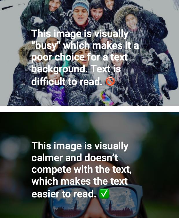
This guideline refers primarily to the presentation of text on a site. All type styles on your site have been designed to meet the size and contrast guidelines for text supplied by WCAG 2.0, however there may still be areas where a content creator is responsible for ensuring good separation of foregrounds and backgrounds. The most common scenario is text overlapping an image, such as in a page header where the page title and an image occupy the same space. In such cases, programatically applied overlays will darken images to meet accessible contrast ratios, but page editors still have a role to play in selecting complimentary images.
Do not design content in a way that is known to cause seizures.
In order to protect users with photosensitivities or epilepsy, nothing on a site should flash rapidly (at a rate of three or more flashes per second), as rapid flashing may trigger seizures in some users. Red flashes should be avoided. This is most applicable to video content, which should be produced in such a way as to be safe for all users. All video content, including ambient video (see below), has been designed for your site with accessible user controls allowing users to pause motion at any time. If video content must include potentially problematic flashing, it should carry an appropriate Content Warning before the video begins.
Ambient video, or decorative video with no audio, used as a design feature postdates the current WCAG guidelines, and as such is not specifically addressed by those guidelines. However, given what WCAG recommends for narrative videos or other animations, and taking into account that ambient video auto-plays upon page load, we recommend the following precautions:
For information on video and audio recordings, see Guideline 1.2.
External resources
• More information on epileptic triggers →
Provide ways to help users navigate, find content, and determine where they are.
For editors, Guideline 2.4 primarily relates to giving content meaningful names and context.
Columbia University Website Accessibility Policy →
Columbia University is committed to supporting information technology that offers individuals with disabilities an equal opportunity to participate in University programs and services. This Website Accessibility Policy (the Policy) sets forth the actions that the University must take to meet its commitment to accessibility.
What is whocanuse.com? →
It's a tool that brings attention and understanding to how color contrast can affect different people with visual impairments.